Lucid Air: redesigning a luxury EV's screens around the driver
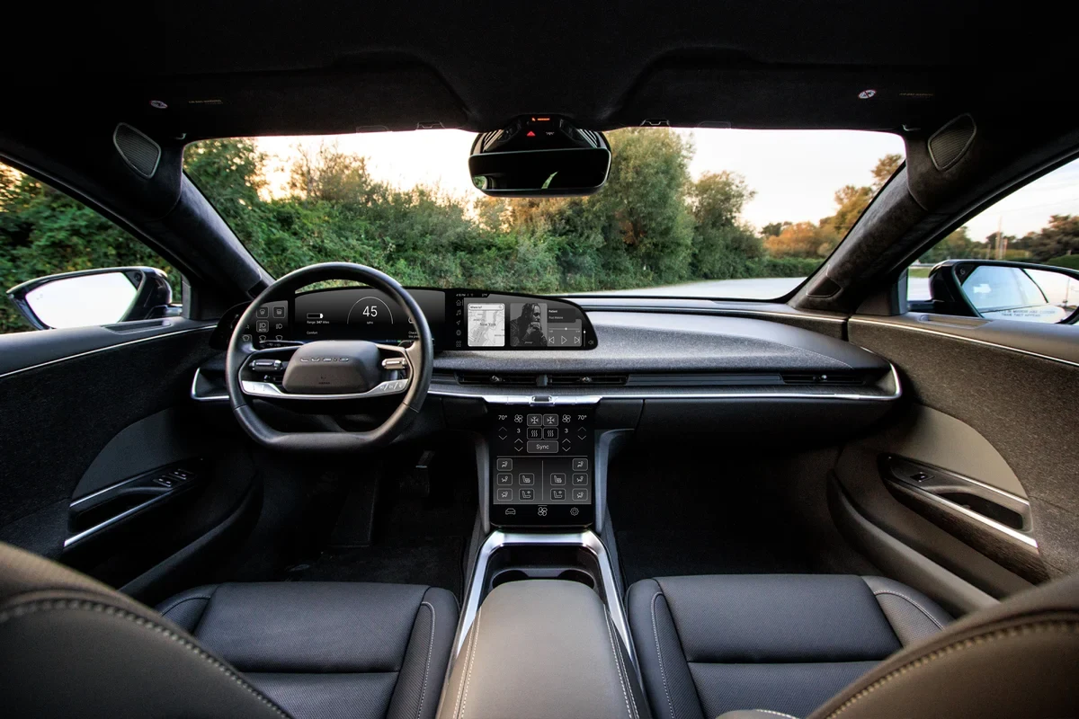
Car screens have to feel premium without pulling attention from the road. I redesigned all four of the Lucid Air's displays to be calmer, more consistent, and easier to use at a glance.
Overview
Problem
In-car screens compete with the road for a driver's attention, so every element has to be easy to find, quick to read, and true to a luxury brand.
Solution
A minimalist redesign of the Air's four screens (vehicle controls, driver display, head unit, and sub unit) with consistent layouts and fewer distractions.
My role
Solo designer and researcher, from the literature review through sketches, content mapping, and high-fidelity wireframes.
Outcome
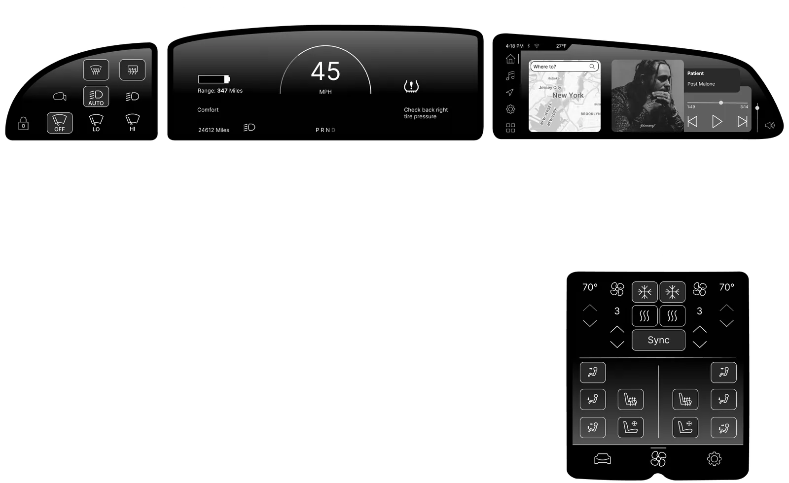
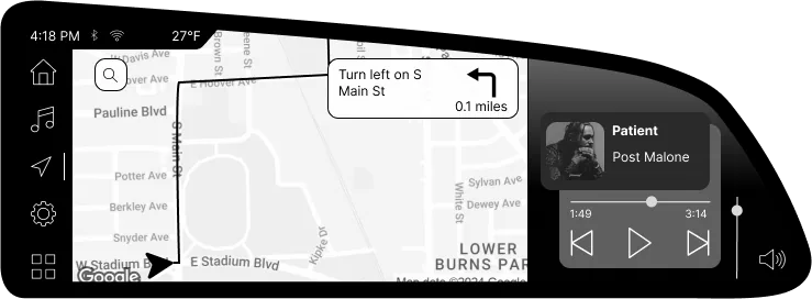
High-fidelity wireframes for all four screens, showing resting states and key flows for navigation, audio, climate, drive modes, and tire pressure.
- Timeline
- February to March 2024
- Type
- Self-directed, solo project
- Methods
- Literature review, sketching, content mapping, wireframing
- Tools
- Figma
The challenge
I've followed Lucid since before its cars were on the road. The Air's cabin is built around a curved display above the steering wheel and a second screen below the dashboard, so much of the driving experience lives on screens.
That's exactly what makes in-car design hard. Every second a driver spends looking at a screen is a second not spent watching the road, so the interface has to deliver information at a glance while still feeling premium.
How might we make a luxury EV's screens feel calm and premium while keeping the driver's attention on the road?
Research
Literature review
For my first literature review, I studied Lucid's brand strategy, visual identity, and the design of the Air itself. Lucid's philosophy centers on sleek minimalism, technical precision, sustainability, and craftsmanship, and I wanted the screens to feel like they belonged in the same car.
Design principles
I translated that research into three principles to guide every screen:
Distraction-free
Show what the driver needs while moving, and move everything else to secondary pages.
Minimal
Follow Lucid's minimalism by removing clutter, not features.
Consistent
Keep key controls in the same place on every screen, so drivers always know where to look.
Process
Sketching the car
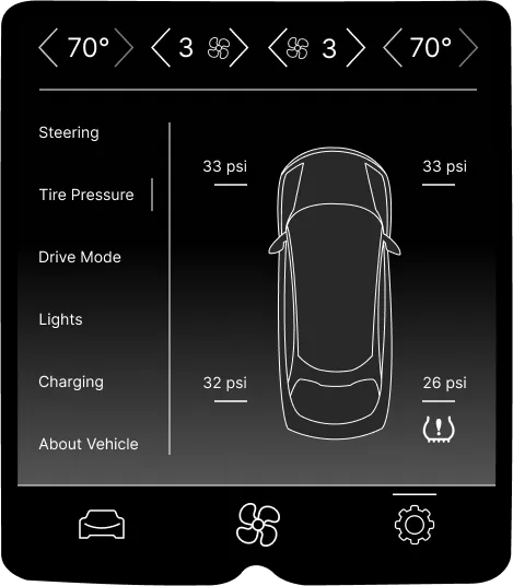
I sketched the Air's exterior from the side and from above in Figma to inform the screens. The top-down sketch later became part of the tire pressure screen.
Content mapping
I framed each of the four main screens and placed labeled content blocks to explore layouts before designing details. I left out the rear climate screen, since its controls are simple.
High-fidelity wireframes
I built the wireframes in black and white so layout and interaction came first, without color pulling focus.
Resting screens
Each screen has a resting state, set mid-drive to show what a driver would see at a glance: 45 mph on the driver display, defrosters running on the vehicle controls, route search and audio on the head unit, and climate control on the sub unit.
Head unit
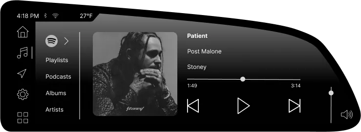
The head unit is the wide display in the glass cockpit, closest to the driver's line of sight, so I kept it focused on what matters while moving.
- Navigation first. The landing screen opens to route search, with a compact music player alongside.
- Audio without distraction. Basic controls stay available while navigating, but full browsing of playlists, podcasts, and albums lives on a separate audio page.
- A control for the passenger. A volume control in the corner lets the front passenger adjust or mute audio, complementing the driver's steering wheel controls.
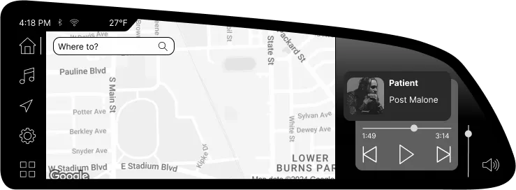
- Navigation rail. Home, audio, navigation, settings, and apps stay in the same spot on every screen.
- Search first. The landing screen opens straight to route search.
- Compact player. Basic music controls stay visible without leaving the map.
- Passenger volume. The front passenger can adjust or mute audio from their side.
Sub unit
The sub unit sits below the dashboard and handles climate and vehicle settings.
- Climate always on top. A climate bar stays pinned to the top of every screen, so temperature and fan speed are always one tap away.
- Navigation always at the bottom. The same three tabs anchor every screen, so drivers never have to search for them.
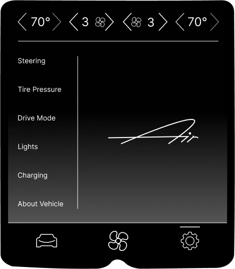
- Settings that are easy to scan. The settings pages list options on the left with details on the right. Drive modes are large, clearly labeled buttons, and tire pressure uses my bird's-eye sketch of the car so each tire's reading is easy to find.
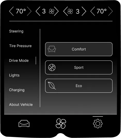
- Pinned climate bar. Temperature and fan speed for both sides stay at the top of every screen.
- Settings list. Every setting is listed on the left, with the current page marked.
- Large, labeled options. Each drive mode is a big target with an icon and a text label.
- Consistent tabs. The same three tabs anchor the bottom of every sub unit screen.
Accessibility
Looking back with an accessibility lens
In-vehicle screens aren't covered by WCAG, but the same principles apply. If I took this redesign further, I'd focus on:
- Glanceability: testing key tasks against NHTSA's driver distraction guidelines, which call for short glances and limited total time looking away from the road.
- Contrast: checking the gray-on-black text against WCAG's 4.5:1 minimum (1.4.3 Contrast) as a baseline, especially for readability in bright sunlight.
- Touch targets: making sure buttons are large enough to hit accurately while the car is moving.
- Alternatives to touch: pairing screen controls with voice and steering wheel controls for drivers with limited dexterity.
Reflection
Lucid Air was my first literature review and my first in-vehicle project. It taught me to prioritize ruthlessly: in a moving car, every element on screen competes with the road for attention, so anything that isn't essential has to earn its place or move to a secondary page.
Next, I'd want to test the designs with drivers to see how quickly they can complete common tasks.