WiseWallet: a budgeting app built around how young adults really spend
Most budgeting apps ask people to do the work. We designed one that does the tedious parts for them, bends when life doesn't go to plan, and shows just enough to act on.
Overview
Problem
Young adults ages 18 to 30 abandon budgeting apps because manual tracking is tedious, rigid budgets break when income changes, and dashboards overwhelm them.
Solution
A budgeting app that imports and categorizes transactions automatically, lets budgets flex between categories, and replaces a cluttered dashboard with a focused Plan Page.
My role
As a UX researcher and designer on the team, I contributed across research and design, from discovery through usability testing and the final Figma prototype.
Outcome
A tested, high-fidelity Figma prototype, refined through five design changes that came directly from research and usability testing.
- Timeline
- September to December 2024
- Team
- Team project
- Methods
- Competitive analysis, survey, interviews, usability testing, prototyping
- Tools
- Figma
The challenge
Existing tools struggle with three things young adults care about: ease of use, transparency, and adapting to their particular situation. When an app makes budgeting feel like a chore or a constant reminder of failure, engagement drops and people lose their best tool for building good habits.
How might we help young adults stay on top of their money without the effort and guilt that make them give up?
Research
We combined three methods so each one could fill the gaps of the others.
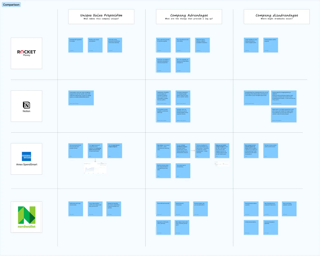
- Competitive analysis showed us what existing apps do well and where they leave people behind.
- A survey gave us a broad, quantitative picture of financial habits and preferences.
- Interviews revealed the motivations and frustrations behind those habits.
What we learned
Manual tracking kills motivation
Entering every purchase by hand was the main reason people abandoned budgeting apps. Automation wasn't a nice extra; it was the foundation.
Real life is irregular
Freelancers and part-time workers told us rigid budgets broke as soon as their income shifted. The app needed to flex with them.
Insight, not information overload
People wanted to understand their trends, but dense dashboards made them tune out. Simple, focused visuals worked better.
Design decisions
Decision 1
Let the app do the tracking
What we learned
I used to mainly add things in the app, and that was way too much work.
What we designed
We connected bank accounts through Plaid so transactions import automatically, then sorted them into default categories that people can review, edit, or approve. Automation saves time while users stay in control.
Decision 2
Budgets that bend instead of break
What we learned
Participants with irregular income said existing tools couldn't keep up with them.
What we designed
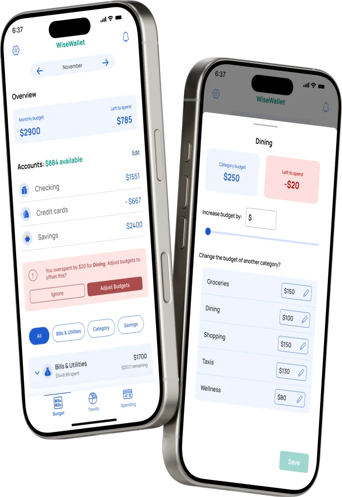
We added custom categories, like separating groceries from dining out, and dynamic budgeting that lets people move money between categories when they overspend or their income changes.
Decision 3
Show trends without the overwhelm
What we learned
I want to see my trends but not so much that it's overwhelming.
What we designed
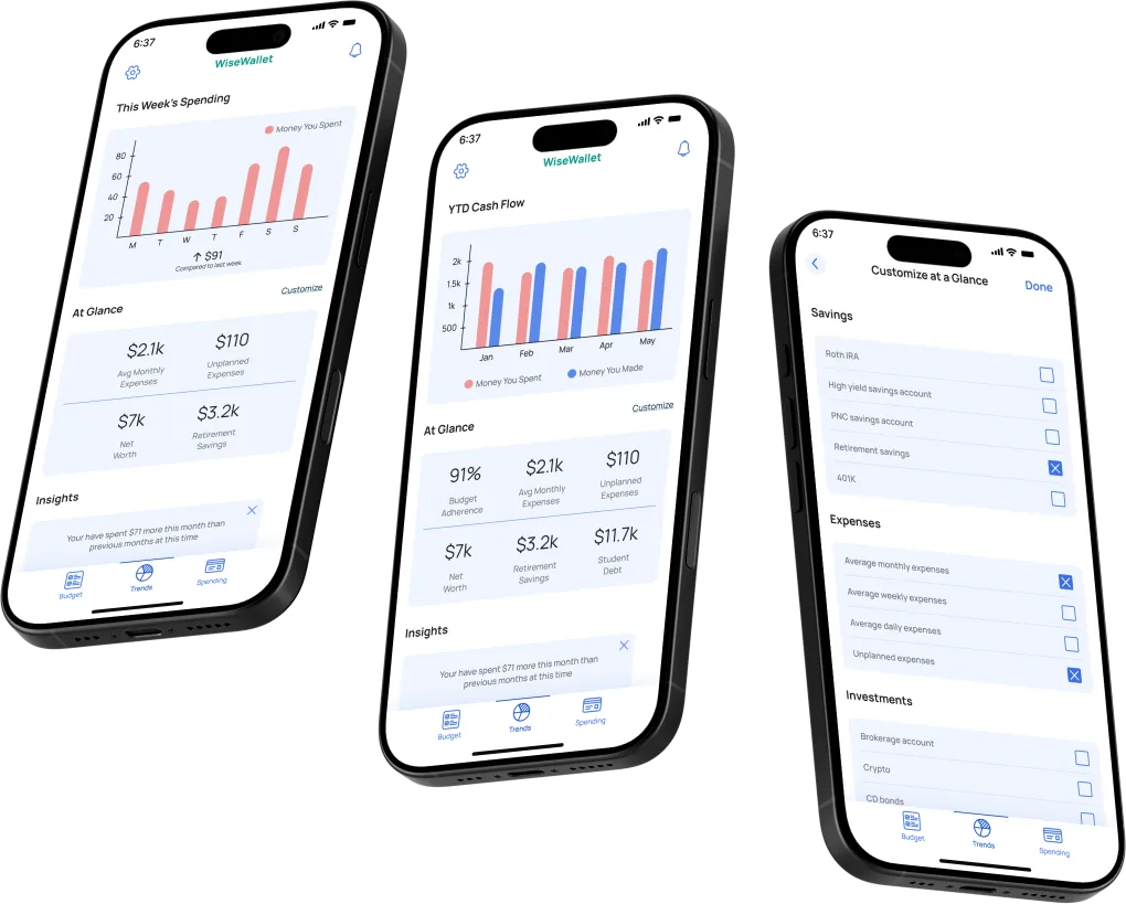
We kept charts simple, mostly bar charts, and let people choose which metrics appear so they only see what matters to them.
Decision 4
Replace the dashboard with a plan
What we learned
This page doesn't tell me anything new.
What we designed
Testing showed our early dashboard just repeated other pages. We replaced it with a Plan Page that brings together what people can act on: remaining budgets, spending trends, and personalized recommendations.
Decision 5
Make recategorizing effortless
What we learned
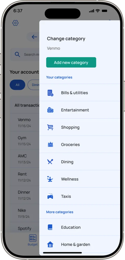
In early usability tests, the dropdown menus for changing an expense's category confused people.
What we designed
We replaced dropdowns with overlays that show every category at once, which made recategorizing clearer and easier.
The final design
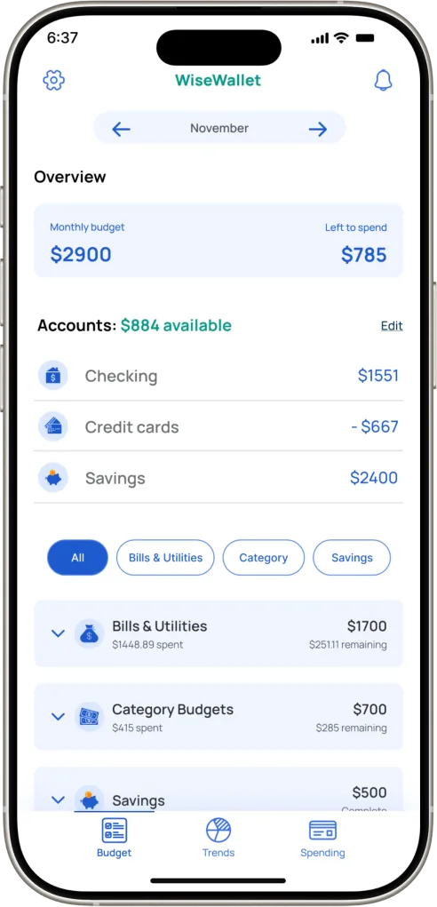
The result is an app that handles the busywork and keeps people focused on decisions:
- Automated tracking imports and categorizes transactions through Plaid.
- Personalized onboarding explains what the app does and lets people set it up their way.
- The Plan Page gathers insights, trends, and recommendations in one place.
- Dynamic budgeting adjusts categories in real time.
- Clear visualizations use simple bar and pie charts.
- Streamlined categorization uses overlays instead of dropdowns.
Accessibility
Looking back with an accessibility lens
If I took WiseWallet further today, these are the areas I'd review first:
- Over-budget states: red highlighting should always come with text or an icon, so the meaning doesn't rely on color (WCAG 1.4.1 Use of Color).
- Charts: bars need at least 3:1 contrast against their surroundings (WCAG 1.4.11 Non-text Contrast) and a text alternative or data table for screen reader users (WCAG 1.1.1 Non-text Content).
- Overlays: focus should move into an overlay when it opens and return when it closes, so keyboard and screen reader users keep their place (WCAG 2.4.3 Focus Order).
- Touch targets: small icons like the edit pencils should be at least 24 by 24 pixels (WCAG 2.5.8 Target Size).
Reflection
WiseWallet taught me that the best automation still leaves people in charge. Every time we removed effort, we also had to make sure users could see and correct what the app did on their behalf, because trust is what keeps people coming back to a finance app.
With more time, I'd test with a more diverse group of participants and explore shared budgets for couples and roommates, along with richer goal-setting.